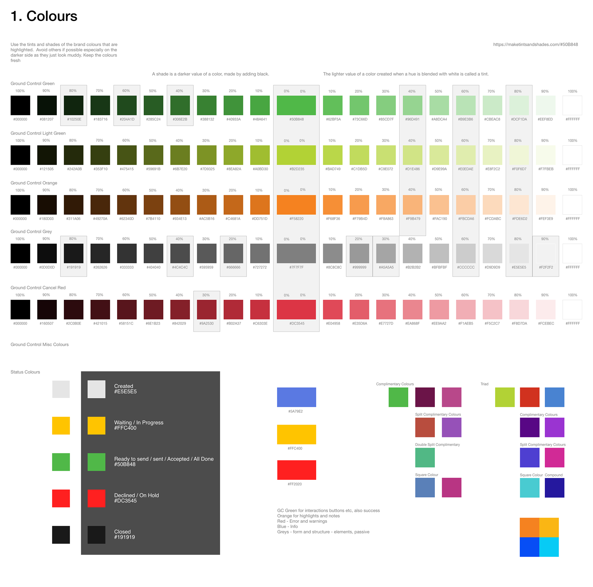
Our colour system builds on the recognition of the Ground Control brand colours to make the UI more usable.
Use the tints and shades of the brand colours that are highlighted. Avoid others if possible especially on the darker side as they just look muddy. Keep the colours fresh.
The Colours are a range of Shades and Tints sourced from the core colours. A shade is a darker value of a color, made by adding black.
The lighter value of a color created when a hue is blended with white is called a tint.
GC Green - #50B848
GC Orange - #F58220
GC Light Green - #B2D235

The current font is Helvetica, this is clean and easy to read and use in the range of designs online. When and if a new font is chosen in the rebrand for the main content then this can be adapted easily. Rich content websites have a larger title than a functional Site or App to save and maximise space for fields and core content. CSS information and examples are provided in the XD file.
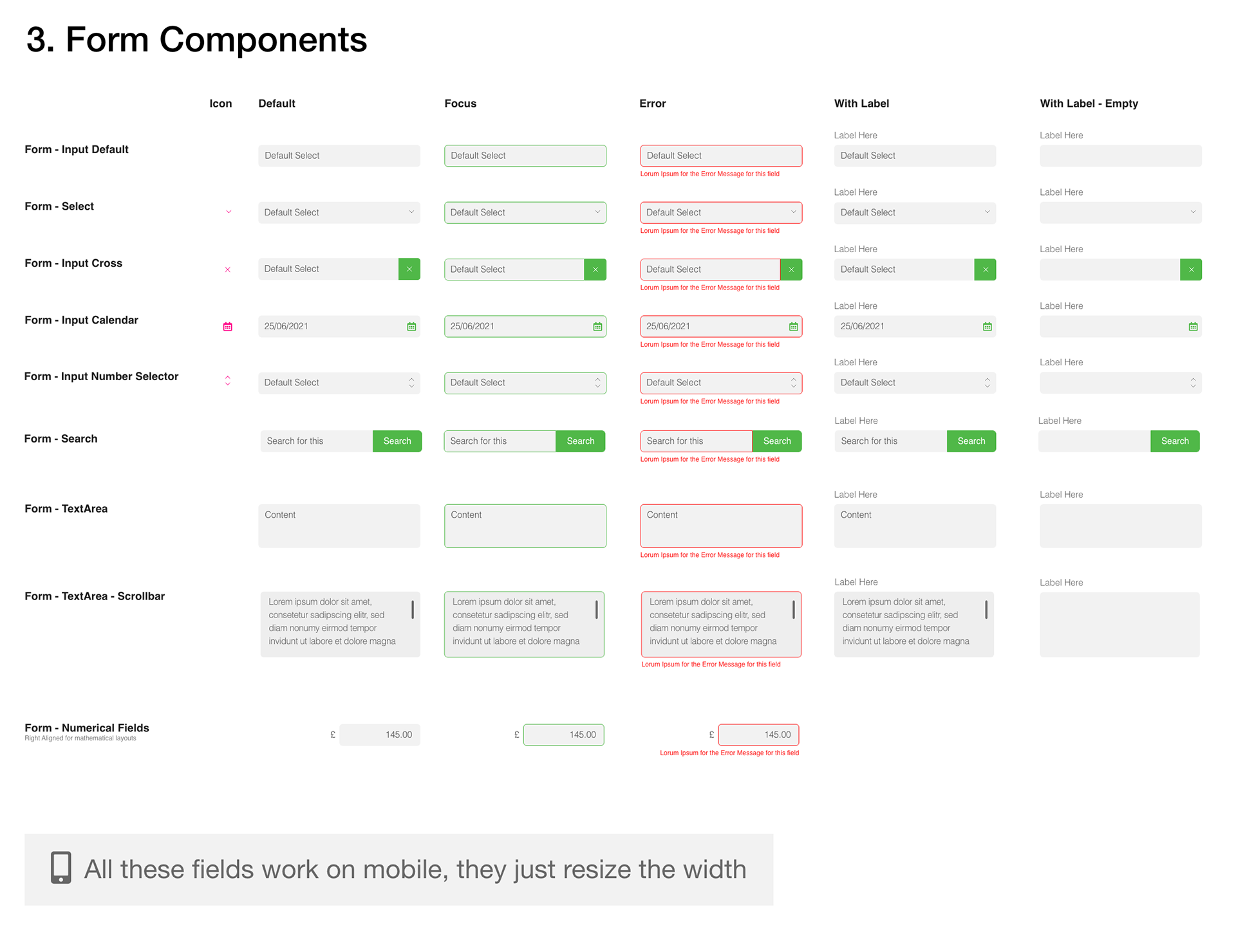
The Huxley project contained mainly forms and this is a core part of this design system. The form fields between the Mobile and Web App have been standardised. The states of the components have also been shown and are included in each individual XD component for easy construction.

These have been created so that they are easy to export as SVG’s and therefore able to be manipulated in code. Progress trackers are important for usability, allowing a user to know where they are in a process and how far there is to go. It helps break down a complicated process into manageable chunks and gives users the drive to complete. Due to the nature of the tracker being landscape they do not work on mobile, you could create a vertical one for mobile, but for now they are just hidden.
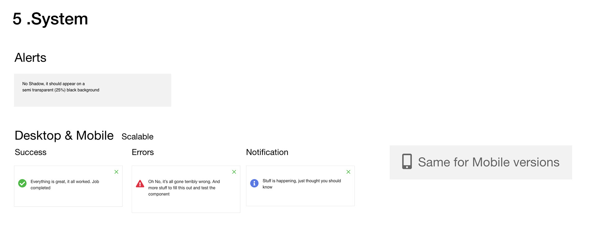

Mainly alerts which are broken down into 3 key areas. Success (Positive - Green), Errors/Warnings (Negative - Red) and Notifications (Passive - Blue) These message boxes are scalable so work well on mobile as well. The loading spinner have also been created as animated SVG.
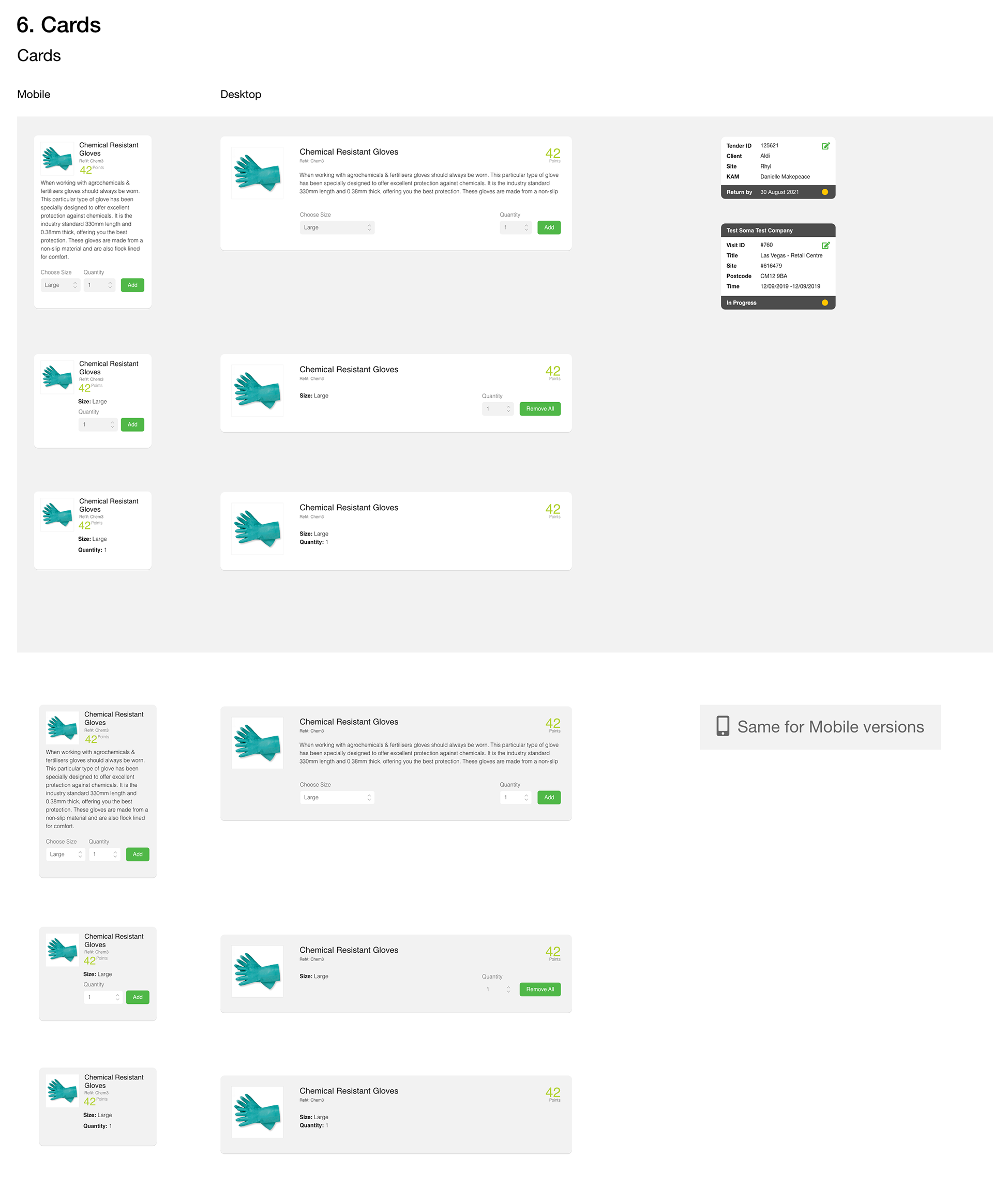
There are 2 Designs of Cards. Firstly for presenting items. These cards were created for items in the shop with a white version or grey version depending on the background. Also a version of the cards were created for Content Summary these have a visual connection to the table summary with the dark grey headers and footers.

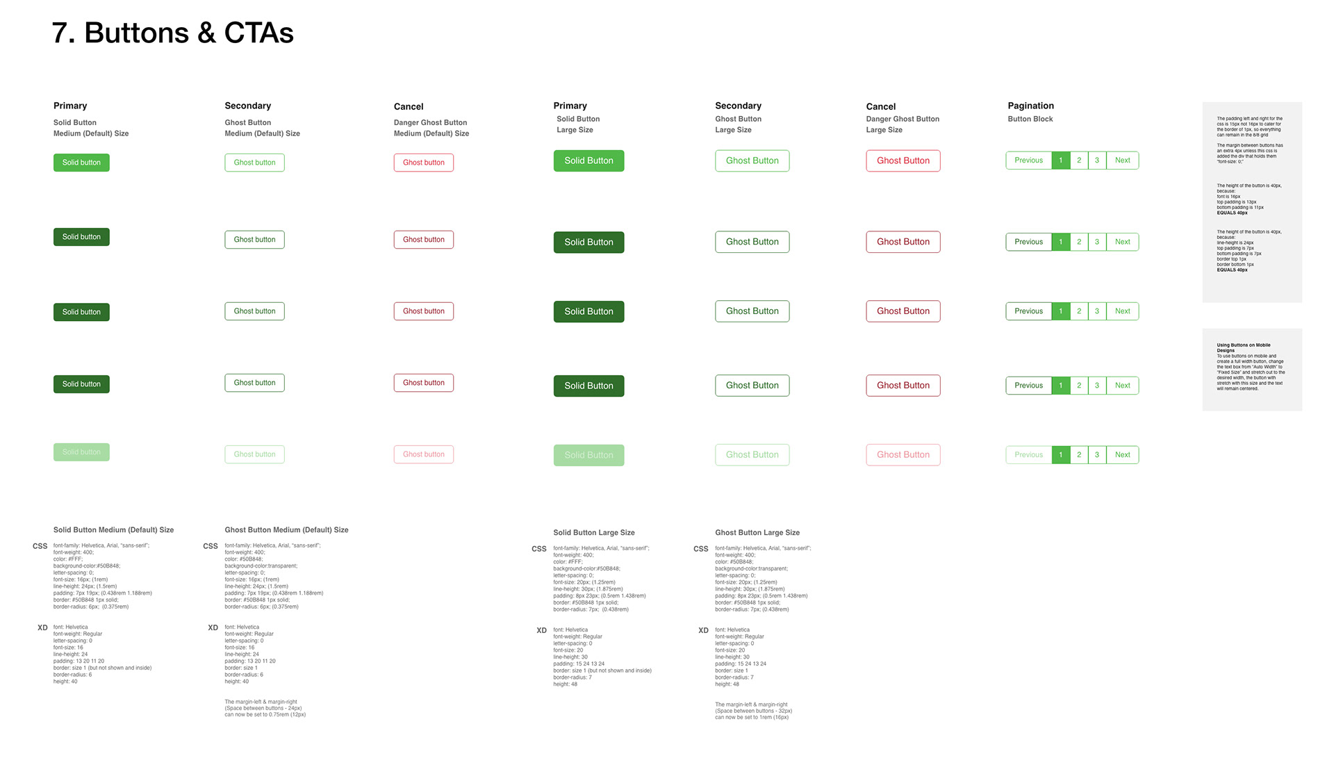
The Dark Green of GC is the best out of the 3 core colours for legibility, and will work on the widest range of colours, it also works best as a ghost button, those with the outlines which in this case are used for secondary buttons. All primary buttons should be the GC solid green and ideally there should only be one of these per set of buttons, so it is very clear what the preferred option is for the user. The Rollover state is a darker green and the disabled button is the semi transparent version of the default state of the button. All CTAs across the sight should be this GC Green, including any clickable icons and link text. Allowing orange to be used as a highlight colour.

The Majority of these icons are Font-awesome (https://fontawesome.com/) if there is an icon not in this set then it has been created. Please use the font-awesome set and if you cannot embed then please use SVG versions. These icons have all been set to a 24px grid minimum.
All GC websites, apps etc should use this set for consistency purposes, if others are used this should be updated.

The Layout & Measurement System is based on the 8px grid.
So components are designed in multiples of 8px.
The layout is based on multiples of 8px.
https://spec.fm/specifics/8-pt-grid
https://www.marcandrew.me/how-to-create-stronger-layouts-with-the-8pt-grid/
Using an even number like 8 to space, and size elements in your design makes scaling for a wide variety of devices much easier, and more consistent.
The basic principle of the 8pt Grid is that you use multiples of 8 (8, 16, 24, 32, 40, 48 etc…) to margins, padding, and sometimes dimensions, on elements inside your design.
It’s a good basic unit to work with. The numbers 4 and 8 are easily multiplied, they provide flexible and consistent, yet distinct enough, steps between them.
Just the LogoMark and LogoType in colour and monochrome.
The LogoMark generally for limited space mainly the Mobile.
The LogoType for a larger areas
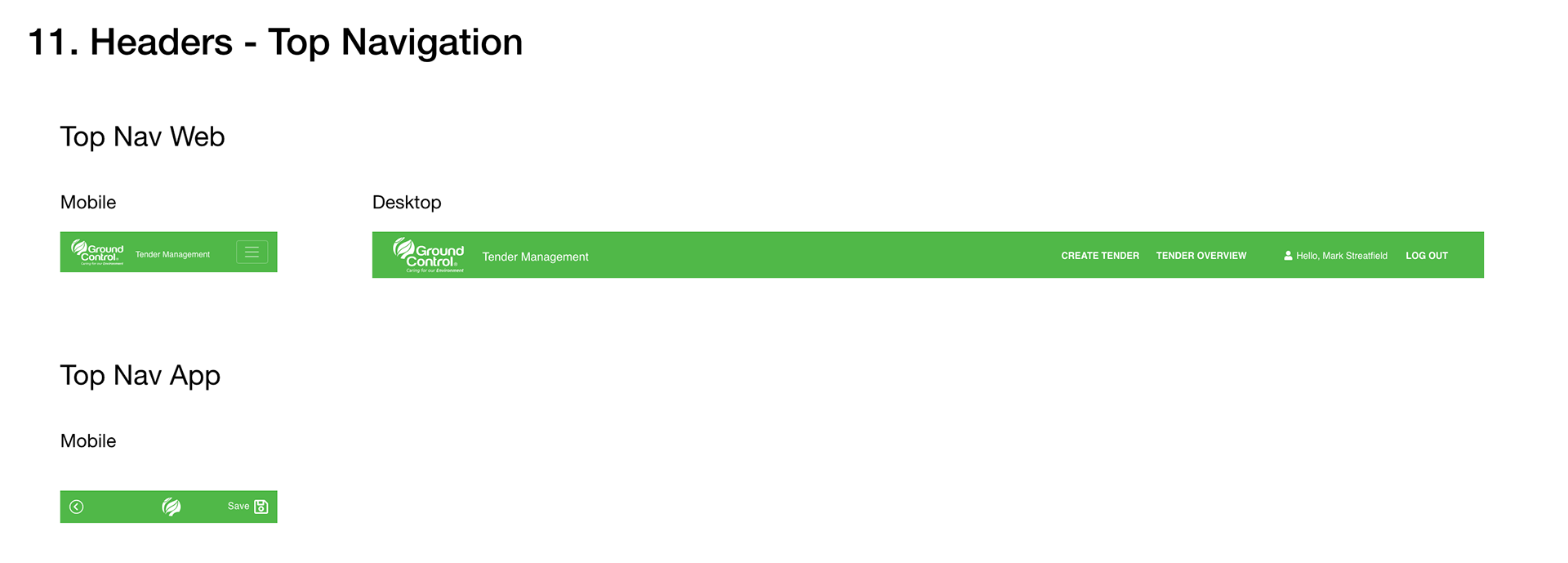
A Simple bar with the identity(Brand) and navigation.
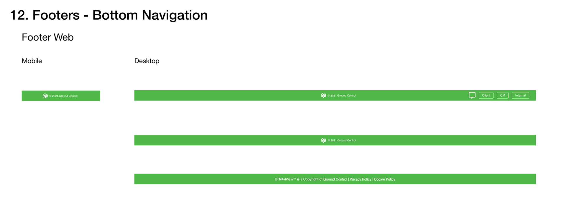
The footer can be used for identity(Brand), navigation, copyright and other navigation options such as the messaging capability.
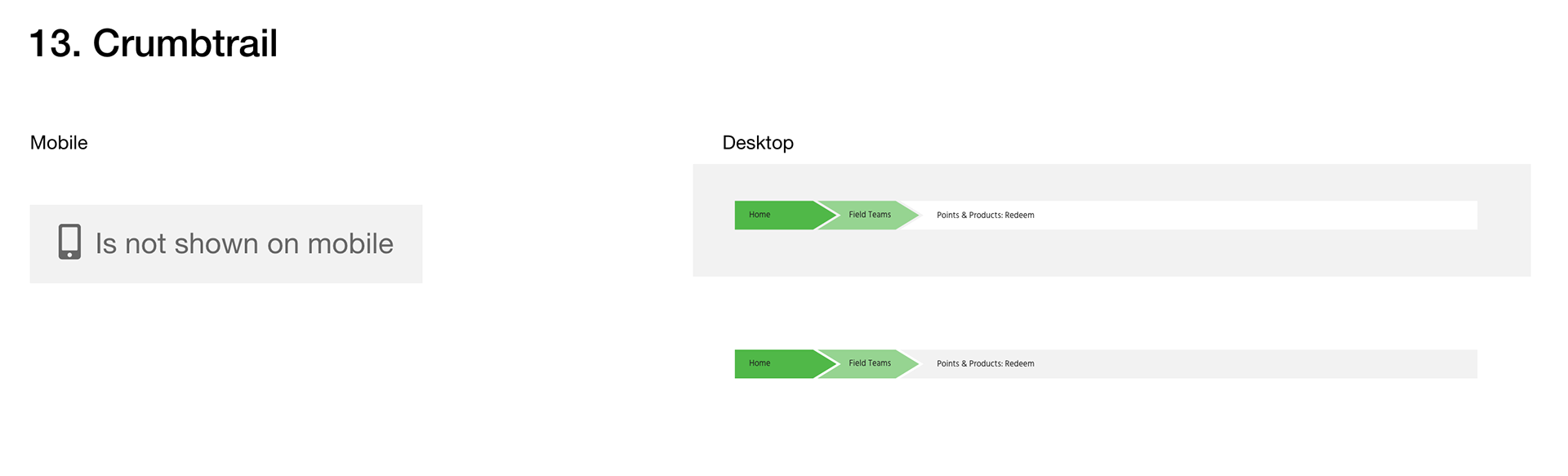
This is a re-colouring of a crumbrail on Total View. This should evolve into a more elegant design.


These Info Graphics are for headline information at the top of the page that are important, from basket points to cost of work and markup. Using the primary brand colours to differentiate elements and using red as the warning colour with messaging, negative numbers and issue with the basket content. A smaller label in grey should be under each larger number.

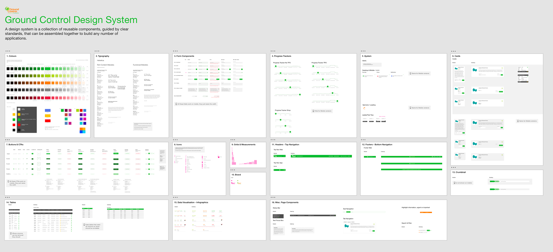
The primary purpose of design systems is to increase efficiency in product development. With a consistent design language in place, it becomes easier to design products at scale that are consistent in aesthetics, user interface, and user experience.
A Colour System, and Naming Convention
Typography & a Typographic scale ( size of the font, weight, line-height, Caps etc)
Icons library
Design Patterns
Grid Systems